
Google Wallet Adds Colorful New Pass Designs for Users
Google Wallet is rolling out a new user interface where passes now fill the entire screen with color, tinting UI elements for a more cohesive look. Users can revert to the older view, but this option may be removed later.

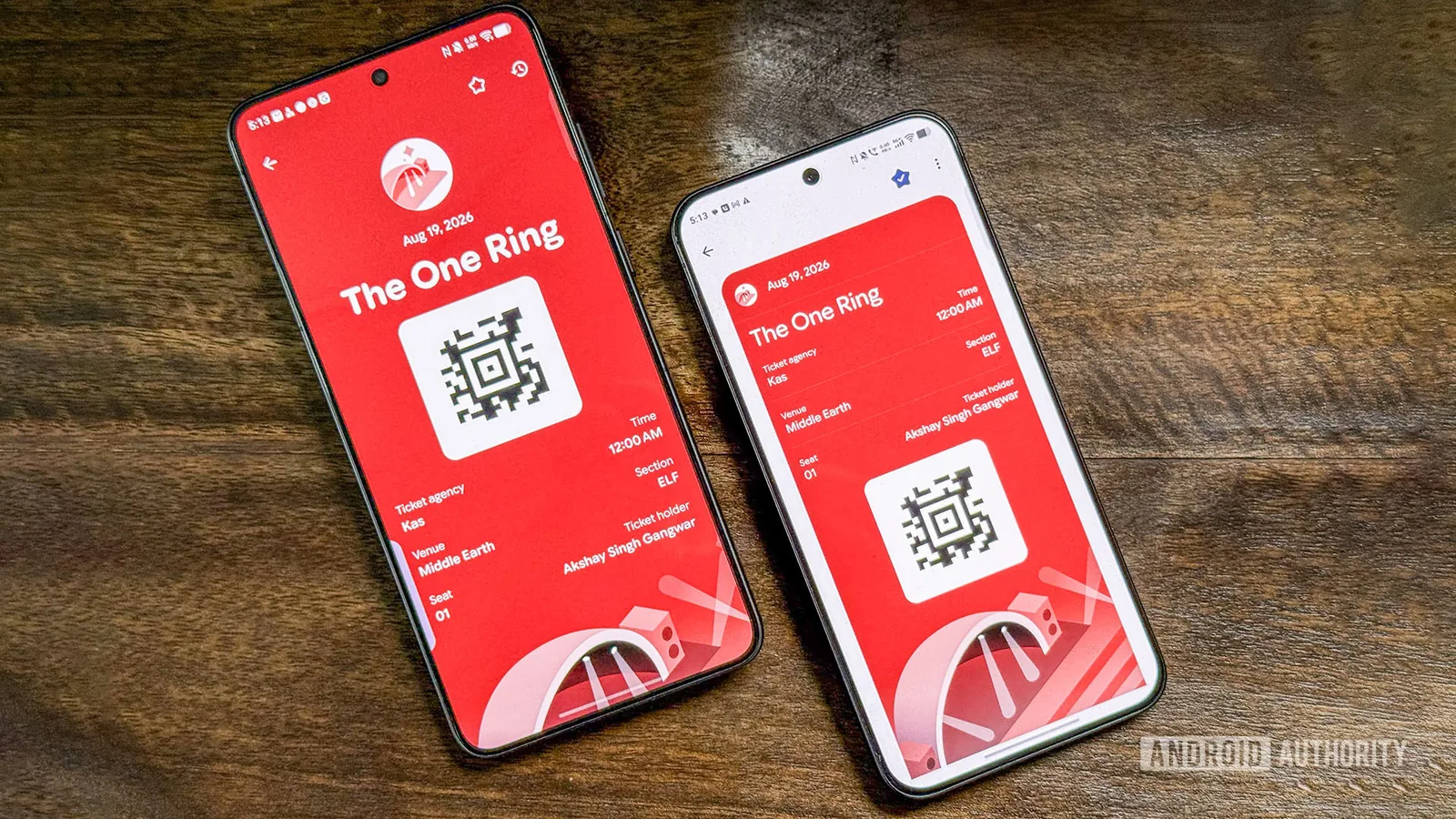
Google has begun distributing a vibrant new user interface for its Wallet application, a design that emphasizes the distinct colors of digital passes. This update, observed in the latest version (v26.32.962917069), causes individual passes to expand and fill the user's screen, while also tinting the surrounding interface elements with the pass's primary color. The aim is to create a more unified and visually engaging experience for users managing tickets, loyalty cards, and other digital credentials.
When a user opens a specific pass, such as a concert ticket or a boarding pass, the app now dynamically adapts its background and UI components to match the pass's designated hue. This offers a departure from the previous, more uniform interface, providing a personalized visual theme for each type of credential. For instance, a coffee shop loyalty card might fill the screen with a warm brown, while a sports game ticket could adopt the dominant colors of the team's branding.
Users Retain Option to Revert, for Now
Recognizing that not all users may immediately embrace the change, Google has included an option within the app settings to revert to the previous, more standard pass view. This older interface displays passes without the full-screen color immersion, maintaining a consistent aesthetic across all items. However, Google typically phases out older interface options over time, suggesting that this revertible view may eventually be discontinued in favor of the new colorful design.
The rollout of this new Google Wallet UI is being handled via a server-side update. This means that simply updating the app to the latest version does not guarantee immediate access to the new features. Google's server-side distributions are often gradual and phased, meaning it can take days, weeks, or even longer for the new design to become available on every user's device. Even among devices running the same app version, some users may see the update while others do not, underscoring the need for patience.
This visual overhaul represents Google's ongoing effort to enhance the functionality and user experience of its digital wallet service. By making the wallet more visually distinct and personalized, Google aims to increase user engagement and make it easier to quickly identify and access the specific pass or card needed at any given moment. The company has been steadily adding features to Google Wallet since its rebranding from Google Pay, aiming to consolidate payment methods, transit passes, vaccine cards, and more into a single, convenient application.